WTD.NL
Brand Identity
- Primary Logo
- Submark
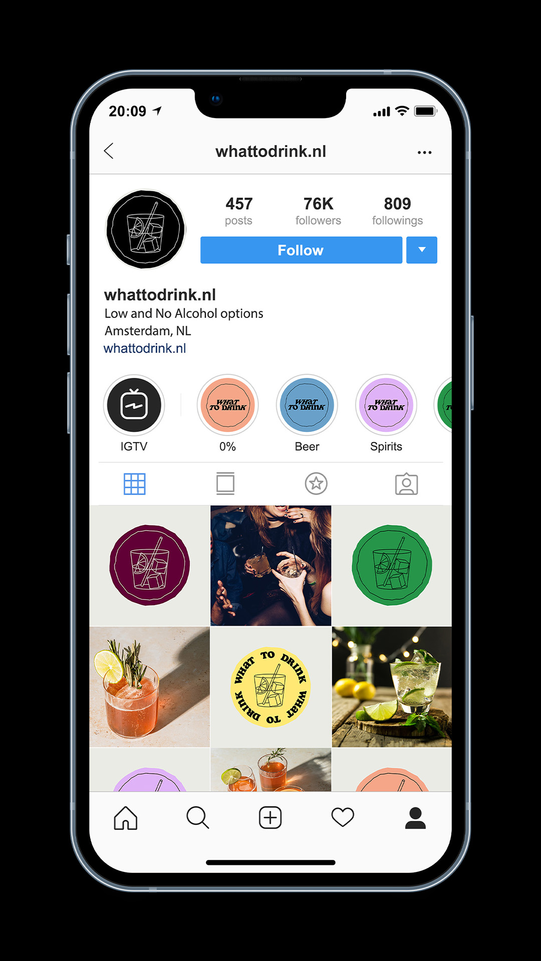
- Social Media Design
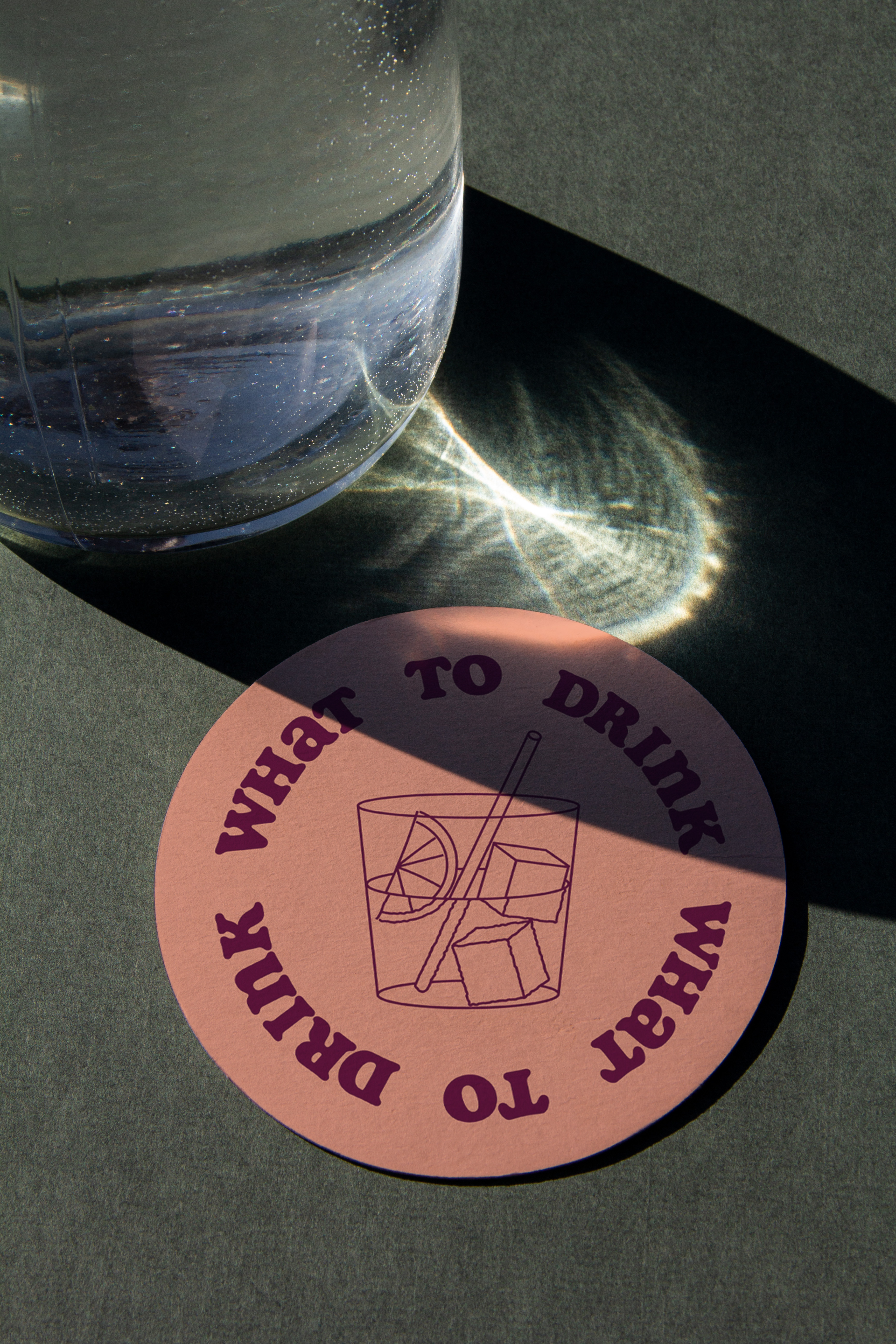
- Coasters
- Business Cards
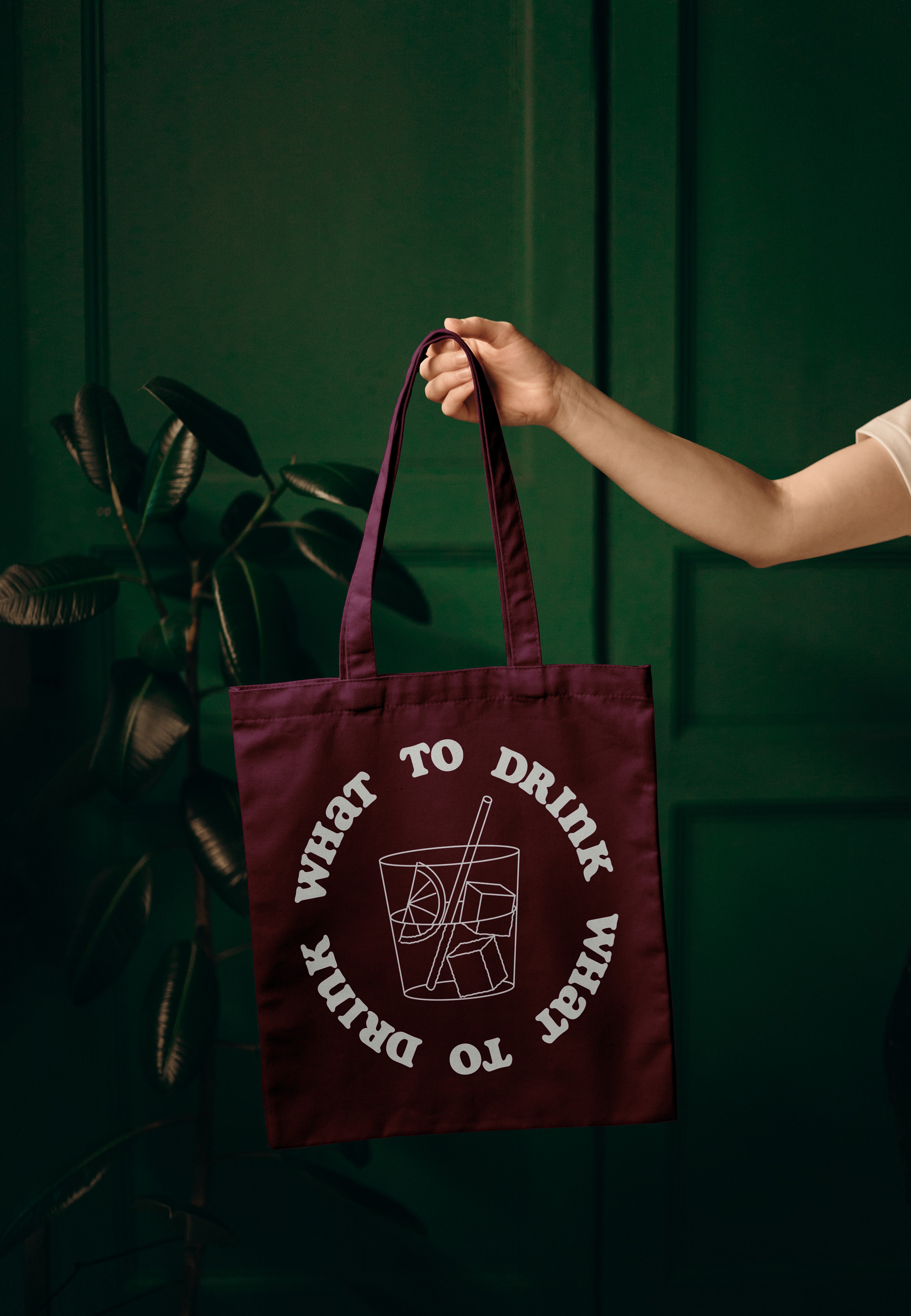
- Tote Bag
Branding for ‘What To Drink’, a Dutch online platform which aims to connect and introduce consumers to the best non-alcoholic alternatives on the market. Recommended by wine journalist Esmee Langereis.
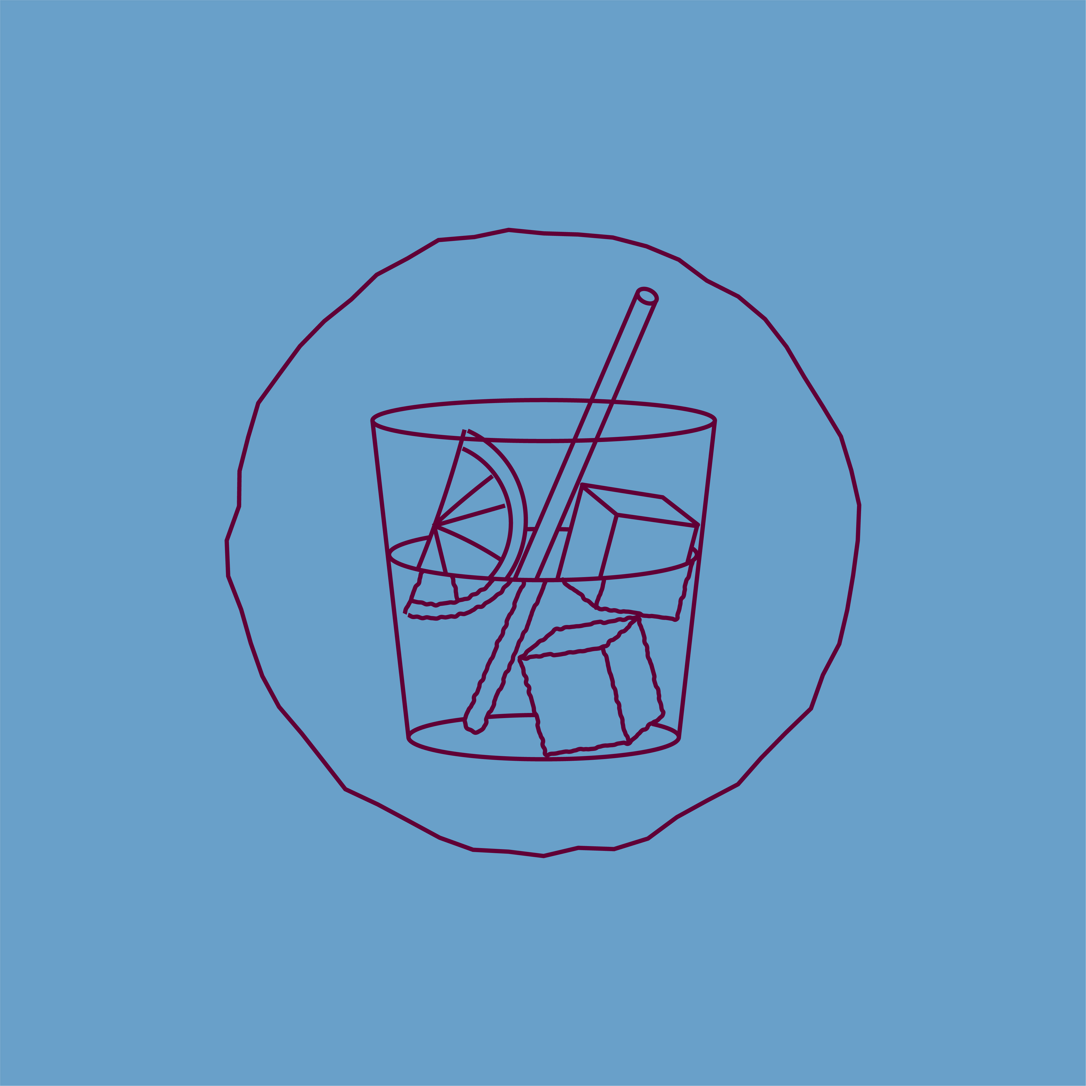
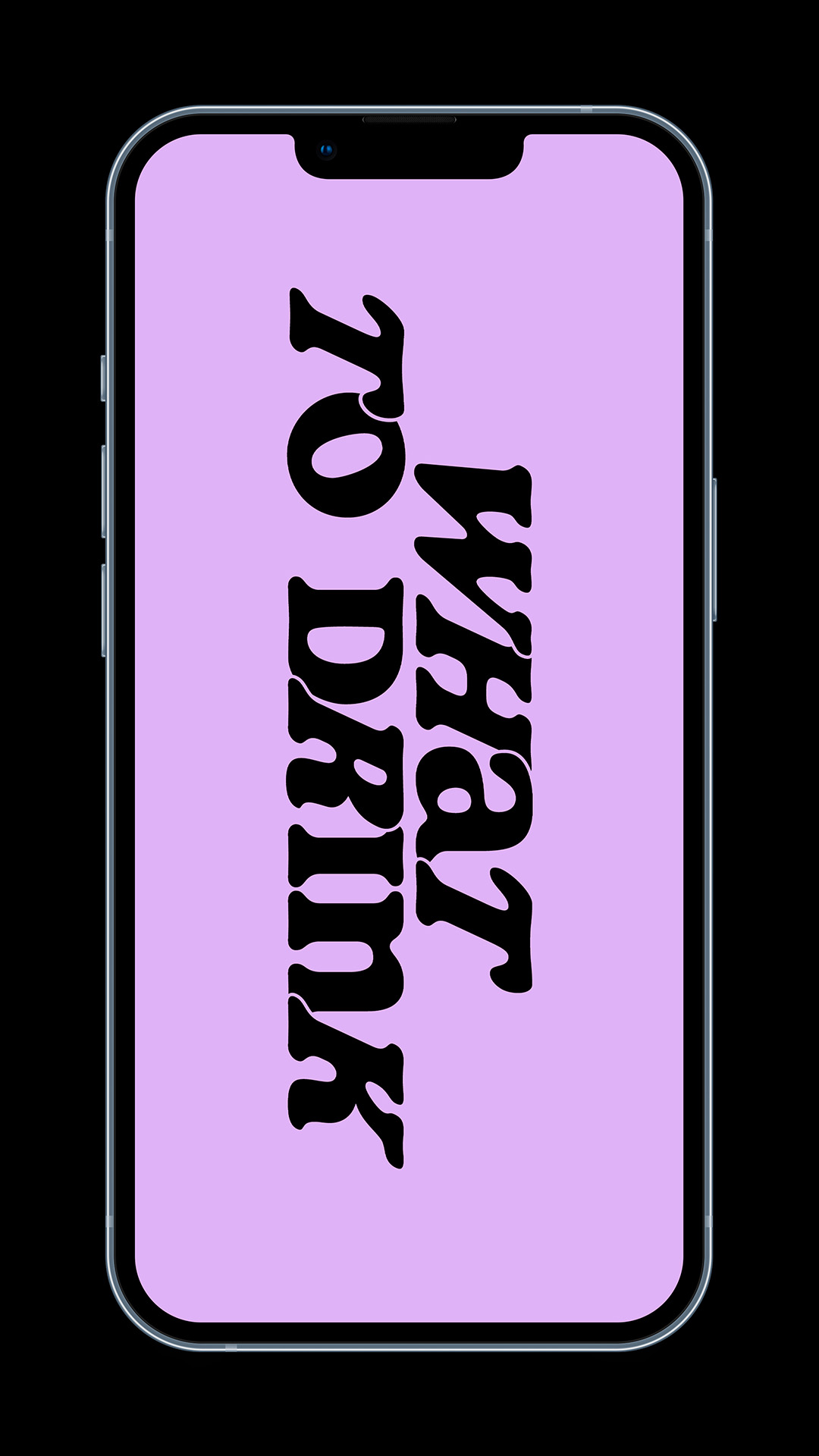
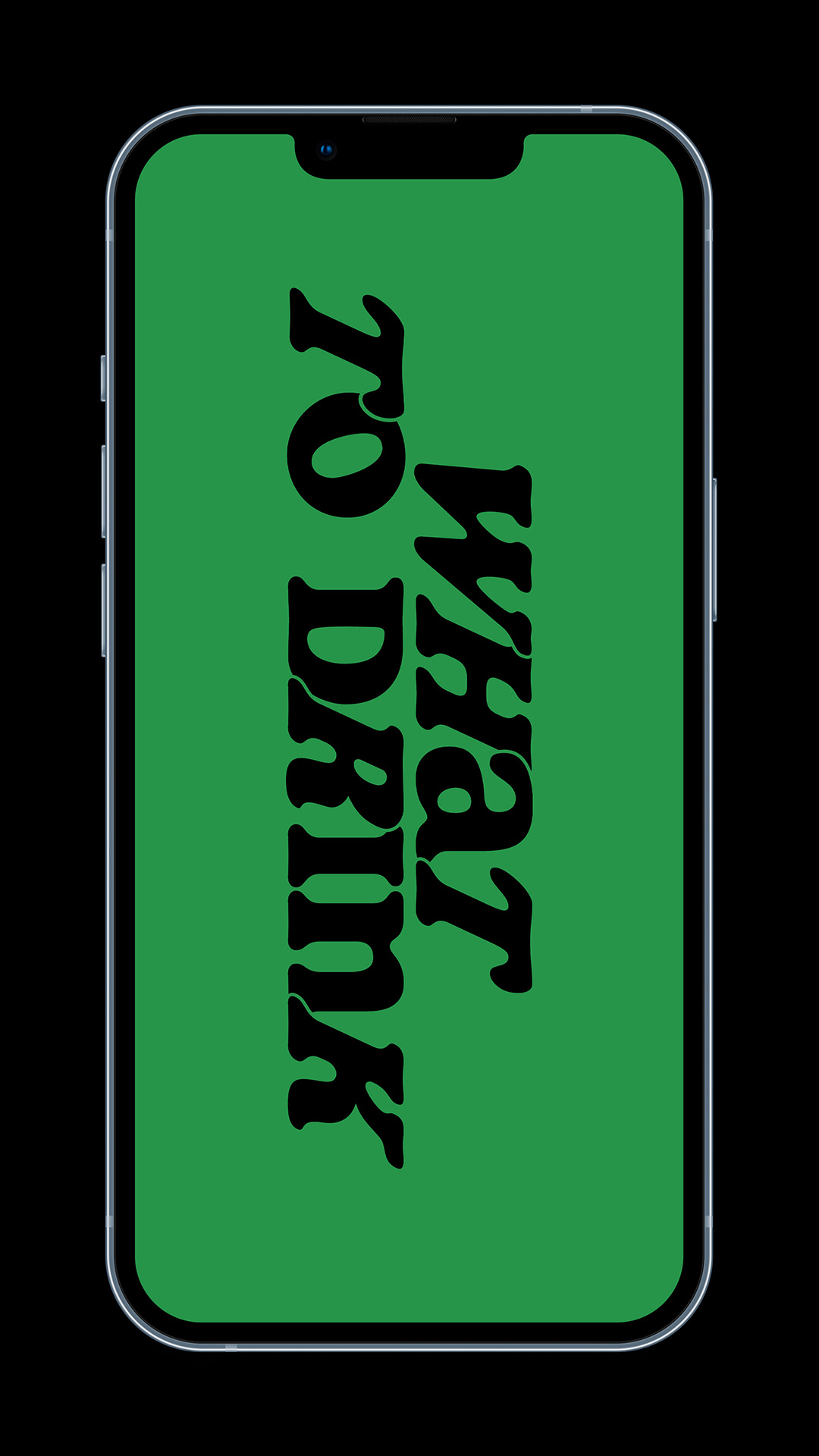
The rugged imperfect circle is one of the main graphic pillars and is inspired by drink ring stains on beer mats or coasters. The wordmark has been typeset with unique features such as shadow gaps, alternating sheared letters and letters in the foreground and background. These subtle differences reference the collective forward-thinking, personality and human aspect of the platform.
Brand Values:
︎︎︎ Connecting
︎︎︎ Sociable
︎︎︎ Mindful
︎︎︎ Educational
︎︎︎ Inspirational